
Design systems that actually scale (without becoming a museum)
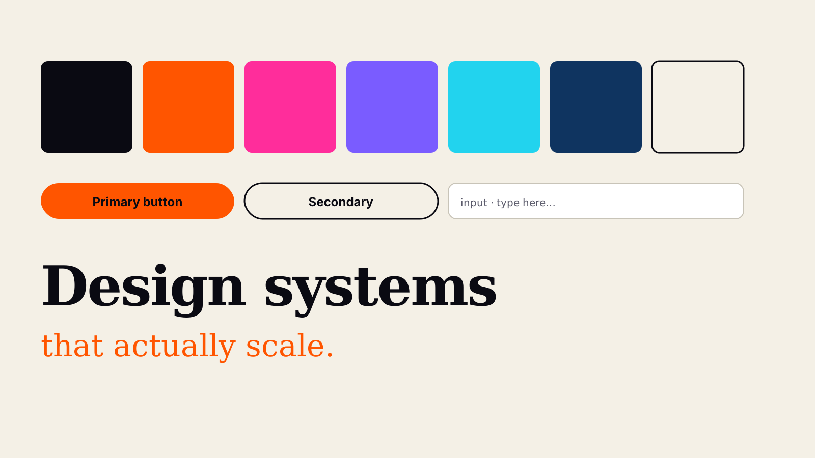
Most design systems die of theatre. Beautiful documentation. Elaborate token hierarchies. Perfect Figma libraries. And no one actually uses them.
Here's how to build one that ships — and stays shippable as the team grows past ten designers and thirty engineers.
Start with the ugly truth
A design system isn't a document. It's a contract between designers and engineers. If the contract isn't being honoured — if designers keep drawing off-token colours, or engineers keep hand-rolling buttons — then the system doesn't exist, no matter what your Figma file says.
Every functional design system solves the contract problem first. Everything else is polish.
The three rules that actually matter
Rule 1: Ship the tokens, not the promise
Design tokens are the atomic unit. Colours, type sizes, spacing, radii, motion durations. Everything else builds on top of these.
The trap: teams spend six months designing a token architecture with three semantic layers, five theme variants, and dark/light/high-contrast modes. Then no one implements it because it's too complex.
The fix: start with a flat, boring token layer. `--color-brand`, `--space-4`, `--radius-lg`. Ship that. Add semantic layers later, driven by real repeated use cases, not theoretical elegance.
Rule 2: One source of truth, always
If your Figma has a Button component and your codebase has a Button component and they can drift, you don't have a design system. You have two design systems that will silently diverge until neither reflects reality.
Ways to fix this, in order of increasing rigour:
- Convention — Figma component is the reference; engineering builds to match; drift is caught in code review. Works for teams up to ~15.
- Tokens-as-code — Style Dictionary (or Tokens Studio) exports one JSON that generates both Figma variables and CSS. Now drift is impossible for tokens; still possible for components.
- Component library published as a package — the React/Vue/Svelte components ARE the source. Figma mirrors them, not the other way round. This is what mature teams eventually land on.
Rule 3: The system has to be editable, not just usable
The single biggest cause of design system decay: it becomes untouchable. A designer needs a new pattern, can't get it added, so they hand-roll it in a Figma file "just this once." Fifteen instances later, the system's authority is gone.
Build in a lightweight contribution path from day one: a template for proposing new patterns, a two-person review, and a monthly maintenance window. Design systems that die die because they were designed as museums.
What actually goes in the system
Ship these in this order, only moving on when the previous one is being used consistently:
- Colour tokens — brand + neutrals + semantic (success/error/warning). Nothing else at first.
- Type scale — 5 sizes, 2 weights maximum in v1.
- Spacing scale — a 4px or 8px grid. That's it.
- Buttons + inputs — the two most-used interactive elements.
- Cards + surfaces — the two most-used containers.
- Nav + layout patterns — page shells the product actually uses.
- Icons — one library, one style, one weight. Not a mixed bag.
Everything beyond #7 is bonus. Chart primitives, data tables, empty states, motion — add these when the product needs them, not preemptively.
The signs it's working
- Designers can't remember the last time they picked a colour from the Figma colour picker. Token menu only.
- A new engineer can build a compliant page in their first week using the component library, without asking questions.
- PRs mention component names, not one-off CSS. "Fixed spacing on Card variant" not "adjusted margin on this div."
- The system gets updated regularly — small, incremental, always shipping. Not perfect versions six months apart.
The signs it's dying
- Screenshots of "the design system" pinned in Slack that no one references.
- Multiple Figma files with slightly different Button components.
- Engineers routing around the library because "it doesn't quite do X."
- Nobody knows who owns it. (This is the real killer.)
Who owns it?
Assign one owner. Not a committee. Not "the design team." One human whose job description explicitly includes maintaining the system. Their success metric is adoption, not aesthetics.
If nobody has this in their job description, the system will slowly die. Every time. This is the most important sentence in the post.
Start ugly, ship weekly
If you're starting a system today, don't try to launch it perfect. Ship an ugly-but-adopted v1 in two weeks. Take the criticism. Iterate. A design system that's alive and imperfect is infinitely more valuable than a beautiful one that never made it out of Figma.
The best design system in the world is the one your team actually uses.
Similar topics

AI video generation in 2026: Sora, Veo & what actually works
Sora, Veo 3, Runway Gen-4 and Kling 2.5 are here. Which one is actually production-ready, what still can't be trusted, and how studios are working around the limits.

The 2026 AI marketing playbook for small brands
You don't need a marketing team of ten to run modern campaigns. Here's the stack we recommend to small brands — plus the mistakes to avoid.